• Skip to primary navigation
  • Skip to main content
  • Skip to footer
The Full Noise

The Full Noise

Blenhiem Graphic Design and Website Designers

  • Home
  • What We Do
  • Work
  • Contact

Design

Brochure design for Khan Photography

June 23, 2009 by Karen

Khan Photography is a successful Christchurch based business run by talented husband and wife team Nazeef and Rachael Khan.

I had the privilege of being introduced to them as they were on the hunt for a Graphic Designer to improve on their previous wedding photography brochure.

This couple blew me away with their work. Still a young company, Khan Photography are steadily gaining a good reputation that is well deserved. Nazeef and Rachael carefully refine each image to achieve the best possible results for their clients.  Their attention to detail in this way is what I think makes them so good at what they do.

Nazeef and Rachael were keen to see the size of the existing brochure and it’s content reduced, so to create an attractive DLE card to replace it, became the brief.
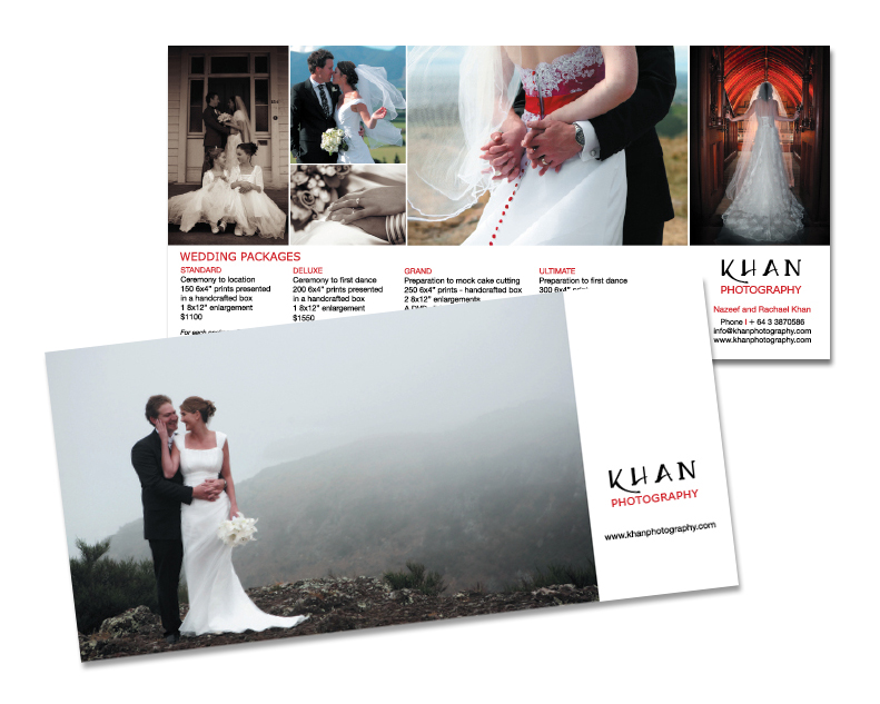
Khan Photography - Brochure design

What we came up with was a clean and simple design, which showcased their stunning work. The change in direction was subtle enough to support their current branding but offered a smart, fresh and contemporary result.

If you or anyone you know is getting married soon, we would defineately recomend checking out  more of Khan Photography’s beautiful images.  You won’t be disappointed!

Filed Under: Print design Tagged With: Business, Design, graphic design, Print design

Print Finishes

April 27, 2009 by Karen

Design in print is one thing. But the design OF YOUR PRINT is another thing altogether. AND well worth taking a look at exploring.

Within the realms of paper finishes and print finishes there is a whole new element to design and the influence it can have over the completed job.

 A designer can and should consider the end product when developing a concept. This means more than taking into account the most appropriate paper stock. It means thinking about how a myriad of other tricks and techniques (within the budget) can be used in tandem with the graphics to meet the brief.

Our son was given an organic cotton toy that was packaged in a special brown shoe box, printed in natural ink colours and die-cut at the side to expose the logo. Everything about the packaging screamed “natural!” to me and even though it had a matt finish and was predominately brown (think paper bag), the overall impression was one of absolute quality and that the product was worth treasuring.

A simple business card doesn’t have to be on clean white stock like everyone elses’ UNLESS this supports how your business is positioned. Sometimes a different finish, such as an emboss or metallic for example, can set your business apart from others as well as saying more about your brand.


Filed Under: Print design, Uncategorized Tagged With: brand, Brief, Business, Design, Finishes, Print design

When it comes to advertising

April 25, 2009 by Karen

It is helpful if your company has a strategy regarding advertising for the year, which relates to your company’s broader brand framework.

Regardless of whether you’re that organised, booking an ad last minute and giving your designer half a day to ‘come up with something’ is a waste of resources.  Even worse if it’s not your designer but someone else’s! My apologies if you’ve ever been forced to do this, but let me explain…

It goes back to the necessity of writing a brief and treating each ad as an investment which must bring back some ‘bikkies’ in return.  If an ad doesn’t do it’s job then it can be a glorious waste of money.

Last minute advertising opportunities are always out there.  Perhaps you have an ad you can rerun, which can fit the space, and you know gets you results.  Great!  But be wary of making a booking and handing your logo over to a publication which can ‘rustle’ something up.  This can weaken your brand and render the ad ineffective.

When it comes to advertising…  Have a plan.  Have an advertisment or better, an ad campaign ready to take advantage of advertising deals when they come up. 

Filed Under: Advertising, Design Tagged With: Advertising, brand framework, designer, last minute advertising opportunities

Less is more…

April 19, 2009 by Karen

Sometimes the most effective visual devices are the most simple.

I was reminded of this over the weekend, as I read to our wee 16 month-old son, and we poured over the illustrations of some of his favourite books.

The ones he enjoyed the most had loads of white space, bold illustrations and simple catchy text.

This is a formula often overlooked in printed media.

The saying, “Less is more” was often overheard where I studied. A reminder to keep students from over-working drawings, or adding too many elements into a design. A bit like the ‘too many chiefs’ analogy; building in too many elements can create confusion.

Giving the eye less to decipher and making the most of the choicest components in a design offers the most impact in the shortest amount of time.  Lets not forget that amongst the hustle and bustle, thousands of businesses compete for those precious split seconds where a glance from a potential customer is the door to a sale.

It’s well worth considering how you can say as much as possible with as little as possible.

Filed Under: Design Tagged With: Design, simplicity

« Previous Page

Footer

M +64 274 458 809
M +64 21 100 7390

facebook icon Instagram icon

©2021 The Full Noise Ltd. All rights reserved.

Copyright © 2025 · The Full Noise 2020 on Genesis Framework · WordPress · Log in